We’re now only a couple days away from the launch of Windows 11 and thanks to a leak, we’ve seen much of the design. If you went ahead and installed Windows 11 build 21996.1, you probably came to the same conclusion as everyone else — it’s just Windows 10 with a new design.
I’m a Windows user, meaning I prefer it over desktop alternatives. My family’s first computer came when I was four years old; it had an Intel 8088 processor and ran MS-DOS. Our second computer ran Windows 3.1, our third ran Windows 98, and our fourth ran Windows XP. Then I moved out and used every version of Windows since. I bought Windows Vista and Windows 8 retail, Windows 7 came with a new PC, and Windows 10 was a free upgrade.
I’m here to say that if all that’s new in Windows 11 is the design change, I’m totally OK with it.
Controversial opinion: The Windows 10 design was bad
I don’t say this much, but despite being a Windows loyalist, I haven’t actually liked the Windows design since Windows 7. I liked that Microsoft was trying new things with Windows 8, and thought that the UX had potential if the firm hadn’t taken so many wrong turns, but I never liked the actual design.
Everyone knows Windows 8 was bad
I’ve never looked at the Windows 8 or Windows 10 designs as what I’d call classic. I’d call them trendy instead. If you looked at Windows 8 at the time, or even Windows Phone, you might say that it looks good. However, it’s the type of thing you look back on a decade or two later and ask, “What were we all thinking?”
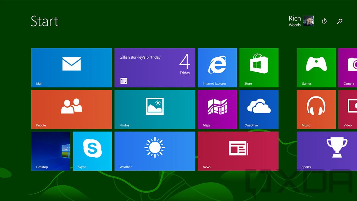
Windows 8
On the other hand, take a look at something like Apple’s iOS 5, or frankly any version of iOS from that era. It looks dated for sure, but it still looks beautiful. This is a design that’s going to stand the test of time. No one is going to look back at that and ask how we ever thought it looked good.
Windows 8 was filled with overly bright colors, sharp corners, and jarring changes in app environments. But let’s not spend too much time on Windows 8, because everyone knows it was bad. Windows 10 was supposed to fix all that.
Windows 10 was supposed to fix everything
When Windows 10 was released, it was supposed to take the best of Windows 7 and the best of Windows 8, and put them all into one OS. It certainly did that. The Start Menu made a return, and the desktop app environment was now the only one, finally letting users put Store apps in windows. When this happened, people praised Windows 10 as being the thing that fixed everything.
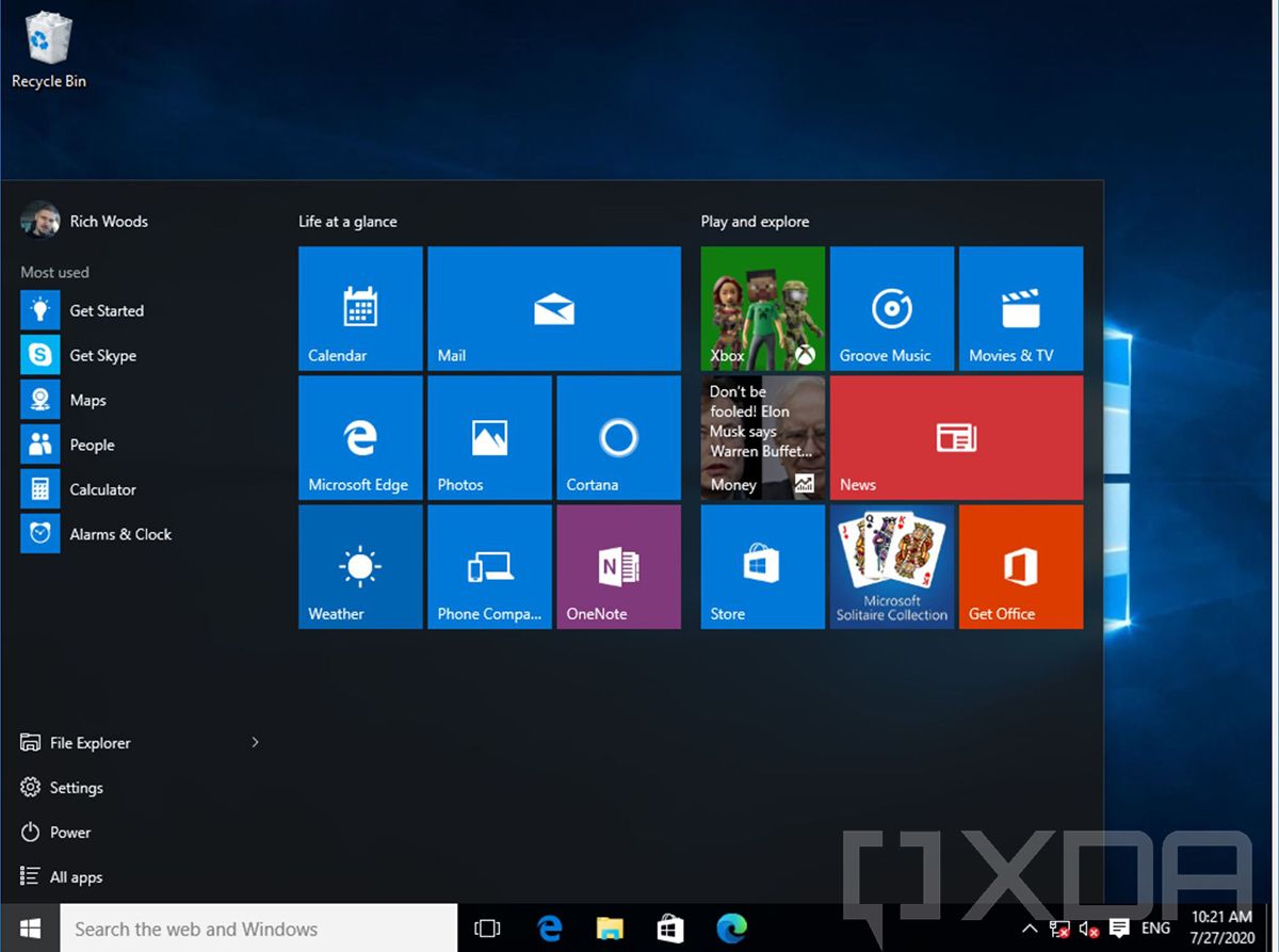
Windows 10 version 1507
We’ve all heard that every other version of Windows is good, right? Windows 8 was bad, Windows 7 was good, Windows Vista was bad, Windows XP was good, Windows ME was bad, Windows 98 was good, and so on. By this logic, Windows 10 was good, and it was embraced as such. Microsoft has this habit of doing things its own way, making everyone mad and then taking feedback and fixing it, yet still not learning any lessons for the next product.
Sure the UX was fixed, but Windows 10 still wasn’t pretty. It still didn’t feel good to use. Sharp corners themselves are jarring to look at when compared to more subtle rounded corners. Those bright tiles were still included in the Start Menu, and it wasn’t until last year that Microsoft finally started to fix that.
I prefer Windows for a number of reasons, but the design hasn’t been one of them in a long time.
Windows 10 is also terrible for tablets
One of the big goals with Windows 10 was to scale back the mistakes of Windows 8. In some areas, Microsoft scaled back too much. It went from having an OS that was built primarily for tablets and touchscreens, to having an OS that really wasn’t optimized for tablets at all.
As I mentioned, Windows 8 had a jarring shift in app environments. If you opened a Store app — called a Metro app — you’d have to swipe down from the top of the screen to close it, and if it was open, it could only be full-screen. You could swipe in from the left to switch to a different app, and swipe in from the right to access the Charms, which were various settings. A tablet would have a Windows logo on it that you could tap to launch the Start Screen.
It was a huge miss. In response to the iPad, Microsoft suddenly decided that everything was going to have a touchscreen and that it had to design Windows for it. Never mind the fact this was getting installed on a ton of traditional devices too.

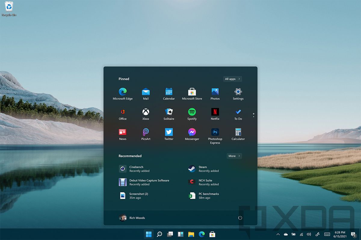
Windows 10 version 21H1 tablet mode
When Windows 10 shipped, those swipe gestures, for the most part, were gone. After all, despite the big emphasis on touchscreens, it turned out the vast majority of devices were either traditional laptops, or touchscreen devices that were being used as traditional laptops. Windows 10 has a tablet mode you have to manually turn on, and it makes apps full-screen along with making some other tweaks, but it’s still not very good.
Windows 10 just isn’t a touch-optimized OS. That’s why there’s always been such a big focus on pens and inking with Windows, because using it with your finger is not a good experience.
Windows 11 design fixes some things
Ever since build 21996.1 leaked, I’ve not only been using it, but I’ve been using it on my main desktop. It’s fair to say that I’ve been living on Windows 11 for as long as I have been. If this is it, I’m happy with it.
The look and feel has changed
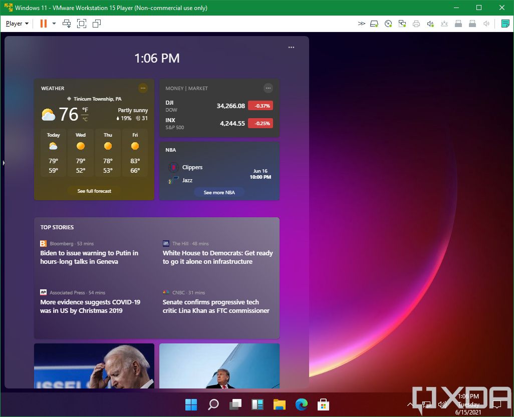
Windows 11 fixes some of my biggest complaints about Windows in the last decade, which is the design. Some of the changes are small and some are big. Here’s a small one: the taskbar is finally centered. For years, I’ve been using TaskbarX to do it, and wondering why Microsoft hasn’t just let us center the taskbar through Settings.
Windows 11 build 21996.1
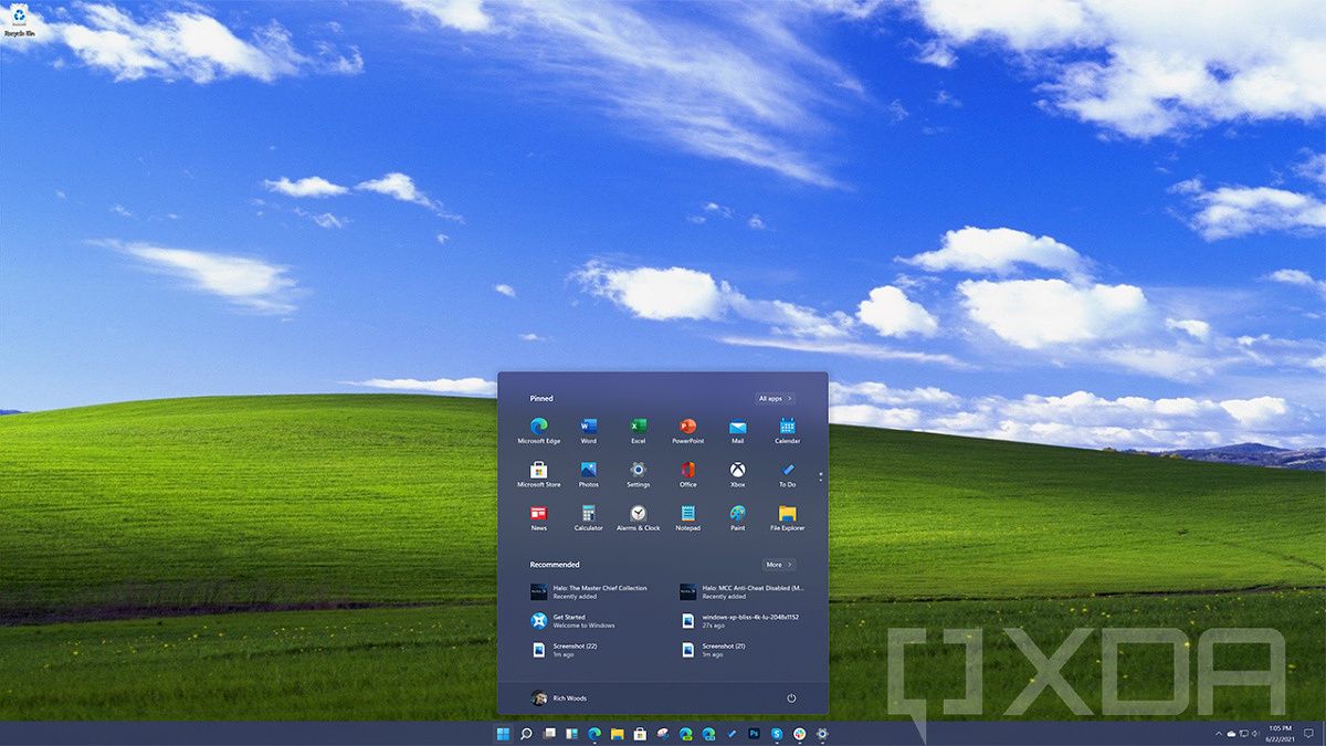
The Start Menu is the biggest change though. That’s centered as well and it’s floating. While Microsoft spent years pushing Live Tiles into the background more and more, all traces of them are finally gone in Windows 11. Instead of pinned tiles, there are pinned icons, which are transparent. Below that are recommended shortcuts, documents, and so on.
It’s almost a running joke at this point that the new ‘Sun Valley’ design overhaul is focused on rounded corners. It’s not, of course; in fact, rounded corners are probably one of the smallest changes. It just feels big because sharp corners aren’t pleasant to look at, and that’s what we’ve been looking at since 2012.
We’ve also got new system sounds. Just like the new UX is more pleasing to the eye, the sounds are more pleasing to the ear. Windows 11 still makes a chime when you change the volume, but it’s actually something that I don’t mind hearing.
Windows 11 build 21996.1
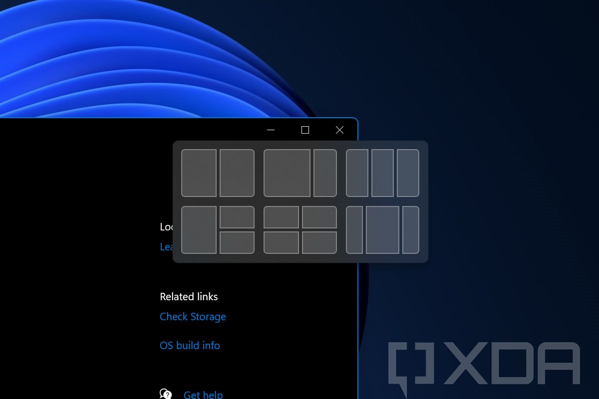
Animations feel more pleasant too. Rather than just instantly launching apps or closing them, there are more transitional animations. The same goes for when you snap apps. Also, if you hover over the maximize buttons, there are more options for snapping apps, which is always welcome.
Windows 11 design is better for touch too
To be clear, based on the leaked Windows 11 build, Windows isn’t suddenly a good tablet OS. It’s just better than Windows 10, which is a very low bar.
Tablet mode is gone, and Microsoft is trying to do what it should have done all along. It’s trying to make it so things work whether you’re using your PC as a tablet or as a laptop. Honestly, the new Start Menu is…well, it’s a start.
Windows 11 build 21996.1
Windows 11 also supports gestures, which are similar to what you’d be able to do on a Precision touchpad, just on a screen instead. You can use three fingers to swipe down and minimize an app, or you can swipe up with three fingers to go to Task View. You can also hold the screen with four fingers to switch between virtual desktops.
Along the lines of animations, it should be easier to manipulate apps with touch. If you grab an app to drag it around, it shrinks in on itself with a blurred border so you can see that you’ve grabbed it.
The design isn’t it for Windows 11
Upon seeing the leaked build, it’s easy to believe this is all there is to it. After all, this was going to be the Sun Valley update to Windows 10 at one point, so it seemed like Microsoft was simply taking a Windows 10 feature update and calling it Windows 11 to build hype around it.
That still isn’t completely false, but there’s a lot more to the story than we’ve seen. To be clear, Windows 11 build 21996.1 is not an early build. It’s a near-final build, and build 22000 is the one that should ship. Aside from some fixes, those bits aren’t set to change.
Windows 11 build 21996.1
Instead, we’re going to see Windows Feature Experience Packs, something Microsoft has been tossing around the Windows Insider Program without saying too much about what they’re for. Now, OEMs can get Windows 11 build 22000, and the OS won’t be finished until later on.
I think that when Microsoft formally unveils Windows 11, you’ll see it’s not just a new design and that it’s fitting to be called a new version of Windows. That’s not what this article is about though.
What I’m here to say is that if this leaked Windows 11 build shipped with just the new look, I’d be here for it. Using Windows 11 just feels so much better than using Windows 10, and I don’t want to use anything else anymore. It just makes me even more excited for anything else that Microsoft might have in store.